
The Origin Story
In Dec 2022, contractors would email their project documents and photos. The the Program Team receiving the files would have to sort out what floor or room the work was done in and which photos went with which item. Since the utilities won’t issue rebates for a project they believe to be illegitimate, project documentation is key to the bottom line. They needed a way to get well-organized project completion packages.
This project, which came to be known as "DI Capture" was born.
Requirements
I met with the program team who receives the documentation to learn about their current process. When receiving documentation, they needed to know:
- Location and equipment associated with the photos (building area and equipment type)
- What specific photos are needed for each requirement
- Proof the photos were taken on site and not manipulated
Pain Points
Their pain points included:
- Long email chains with the contractors as the only way they managed projects
- No consistent naming conventions for submitted files or photos
- Time consuming to sort and organize materials upon receipt
How might we collect documents and photos systematically?
I met with the program team who receives the documentation to learn about their current process.
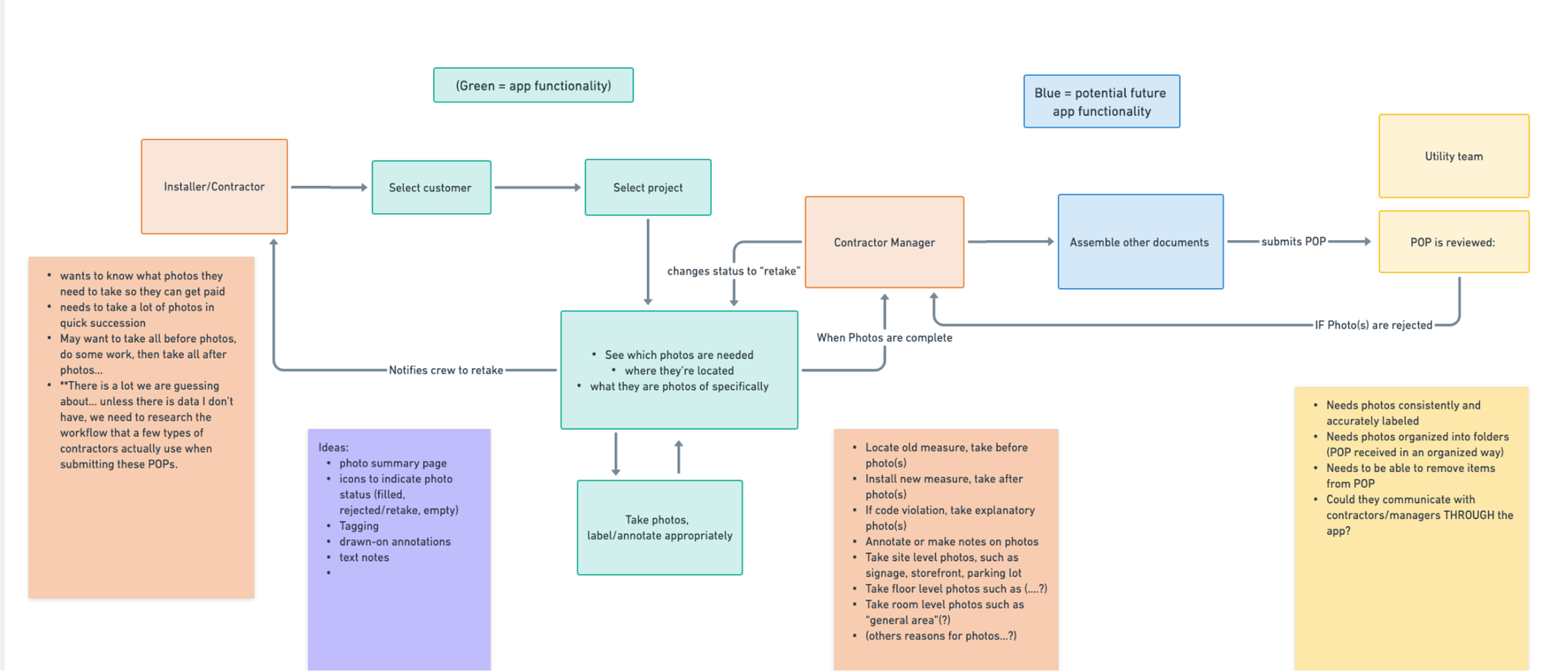
I thought about the mental model of a commercial building: Floors, rooms, and the energy-saving equipment that would be installed in each area. Using friction to slow contractors enough to confirm their location before taking a photo, I suspected we could reduce errors and confusion. And by assigning unique places for each required photo, the system could name them accurately and specifically.
Early ideas for MVP
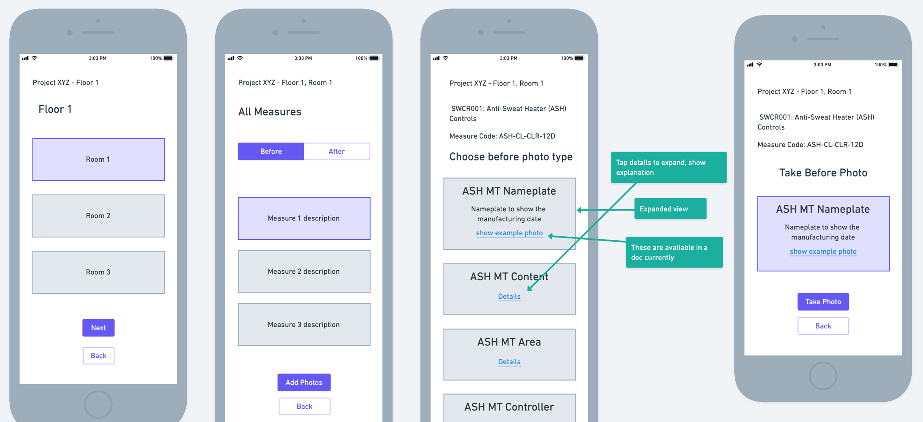
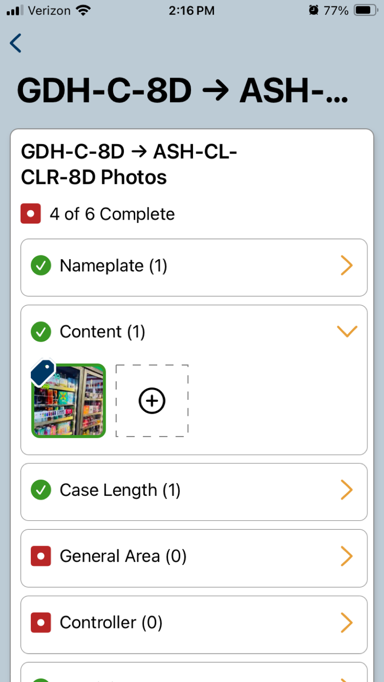
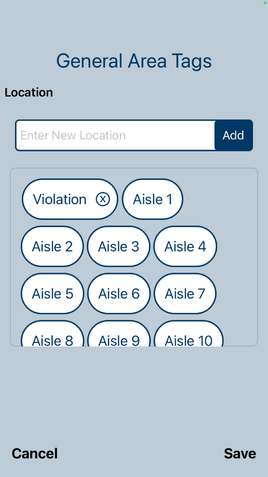
- Break down the photo list into areas matched with the floors and rooms of the project site, so contractors can drill down to an exact location
- System assigns standardized file names automatically, based on area type and requirement
- System geotags photos to verify location, so the program team can be more confident they’re not manipulated or reused from another job
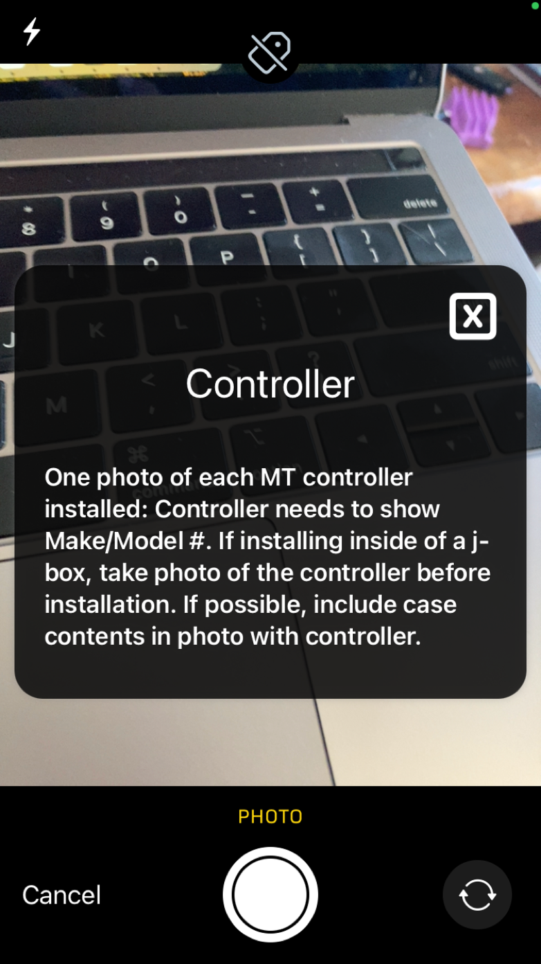
- Descriptive requirements listed for each photo, right in the app, so contractors have clear direction
Research and Testing
In the interest of time, the team decided to forego user interviews and went straight to coding the MVP.
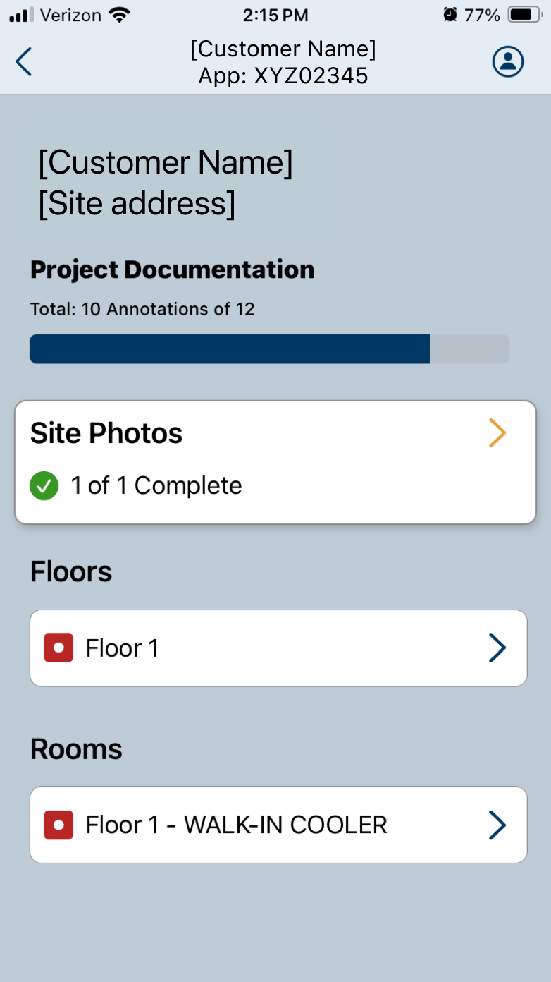
Test Environment
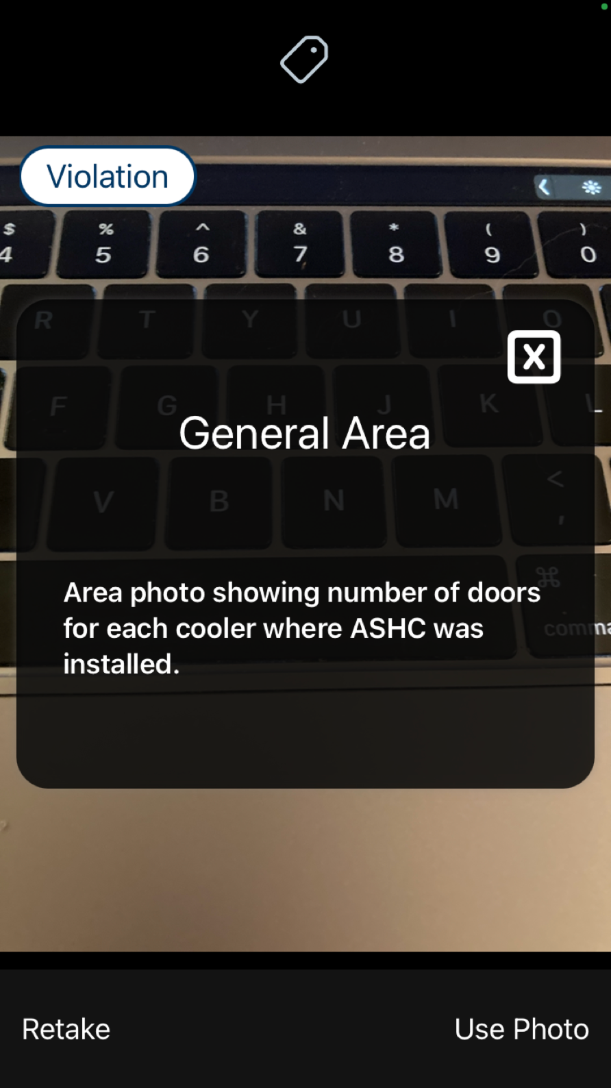
Screenshots of the early live app
Added Complexity
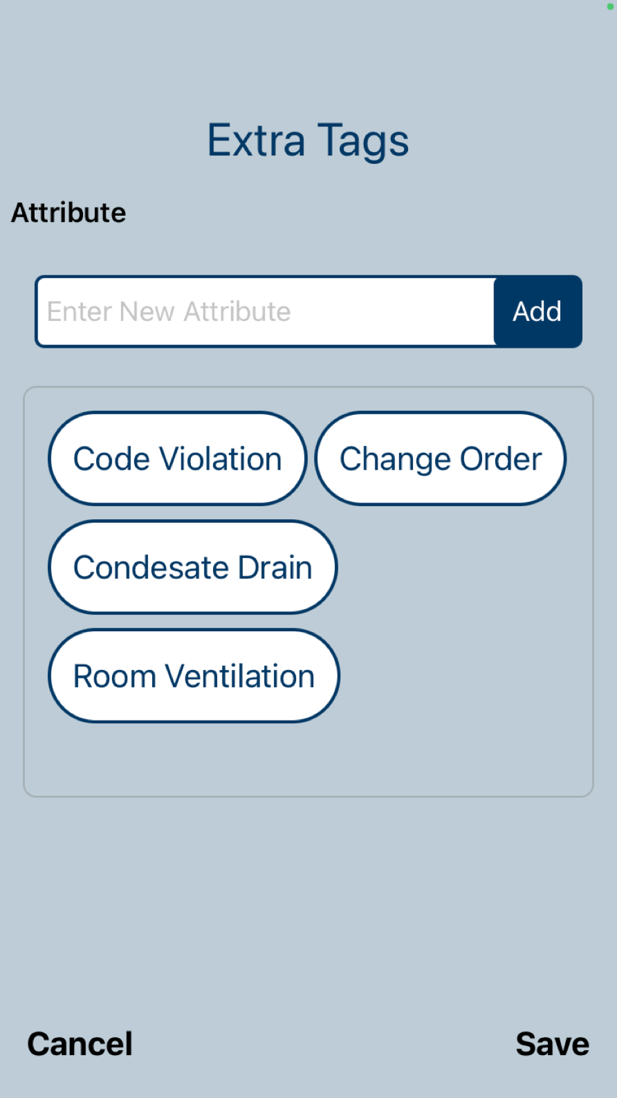
With the MVP out, we started to learn more about the complexity of the situation. During on-site testing, some new needs surfaced, related to communicating with the Program Team in the back office. Code violations, updates to the project status, and requests for change-orders, we learned, are all part of the day-to-day and needed to be accommodated.
A Quick Solution
Development responded quickly. Users are now able to add tags depending on the type of photo, in case they need to document a violation or request a change order.
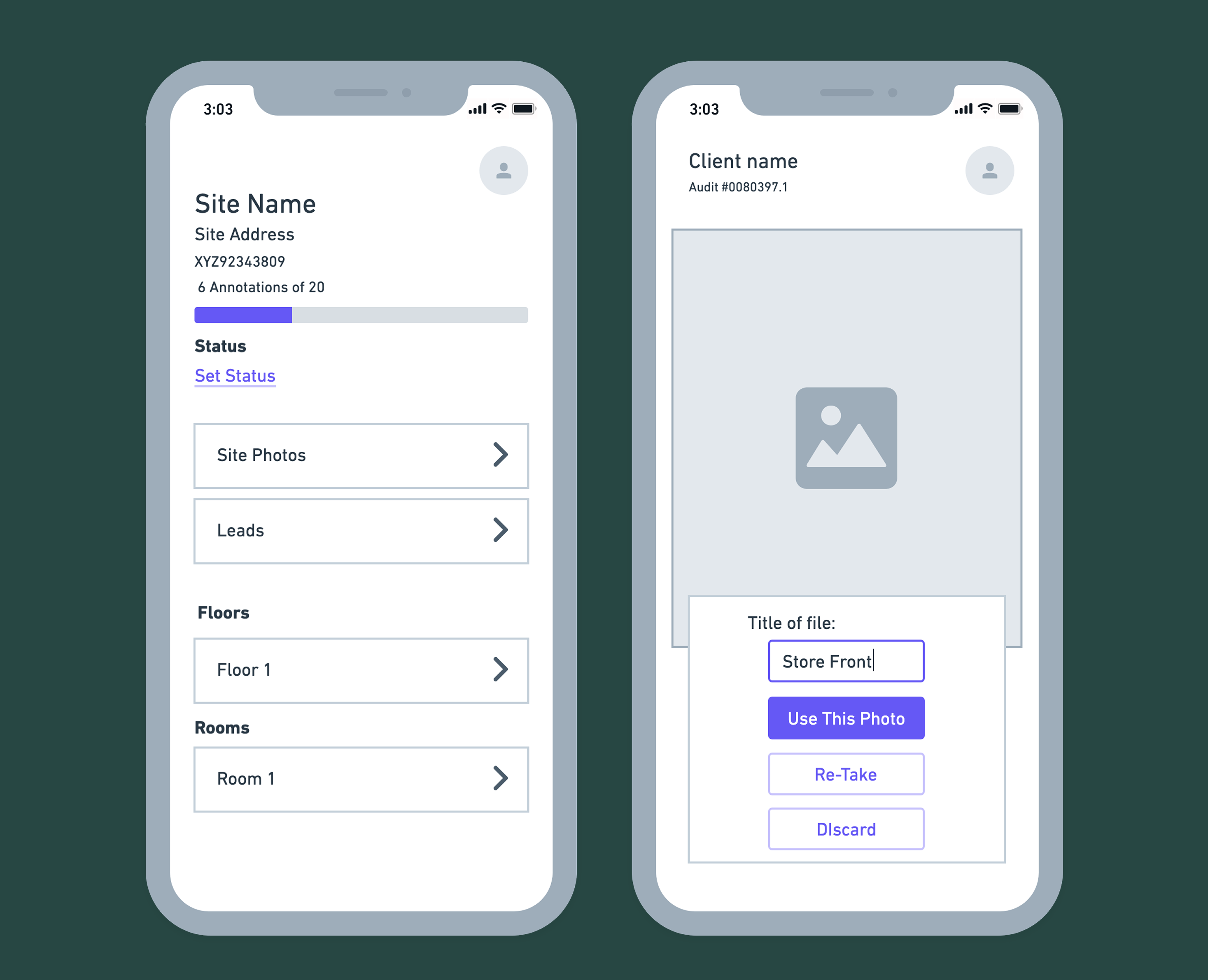
More polished mockups

I developed a more polished look for the tool in Figma. This was ultimately abandoned by the team in favor of using the color theming to match the other, more visually complex apps. Because of time constraints, no custom components were built.
Measuring Success
“DI Capture brought the 20% rejection rate down to less than 5%”
According to the pilot Program Team
Recommendations
- Supporting translations, especially for photo descriptions, since many contractors are not native English speakers
- Developing new, easily distinguishable components so that setting status and making change orders will look distinct from regular photo attachment slots
Thanks for Reading
I'm happy to go into more detail on this project on a call. Thanks for your time.